When I think of the region we live in, the first thing that always comes to my mind is Studebaker. My great grandfather was a photographer for the automaker, and these cars have always been a favorite in my family. They’re unique, and they paved the way for other makes and models from other auto manufacturers. I just love these 1950’s era “bullet nose” Studebakers especially. They have this retro-futuristic vibe and are simply a head turner. As the polar vortex sent the midwest into deep freeze a little over a week ago, I was dreaming of warmer days and getting to go to the annual Studebaker show at the local fairgrounds. Maybe one day I’ll know the joy of driving one of these down the road, but for now, I decided to rebuild one of my own in Illustrator.
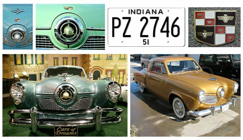
The first thing I had to do was gather some reference material. After doing some research I landed on a 1951 Studebaker Champion. I knew I wanted to show the iconic bullet nose from the front, so I needed to find photos in this perspective, or close enough to it. There are some details such as emblems and ornaments that I wanted to make sure to capture as well, so I needed to find references for these. Lastly, I wanted to make sure the license plate was in the same era, for extra authenticity.

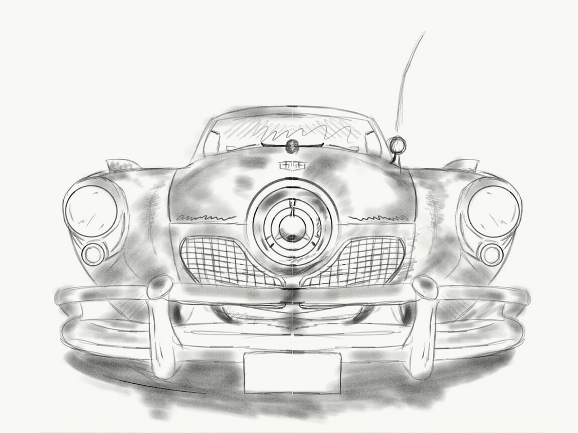
Next, I did a rough sketch to get an idea of how I would build this in Illustrator. I always start illustrations with sketches, because I feel I learn the nuances of the subject better. It allows me to work out any pitfalls without being tied down to something with more permanence. I like to sketch digitally using an iPad Pro and Adobe’s Sketch program.

After getting my sketch down, I imported it into Illustrator and got my workspace set up. I decided to do a 24×18 poster, a pretty standard size in the poster world. Doing a screen printed poster, you have to think ahead a bit. Cost is something to keep in mind and in this realm, the more colors the higher the cost typically. This is because each color is printed as a spot color, individually. I always try to use the paper color to my advantage as well. I landed on 5 total colors. 4 printed and then utilizing the color of the paper. When choosing these colors you have to keep in mind shadow, highlight, and your midtone or accent color. I try to keep things on the monochromatic side or close to it to make it easier for smooth transitions. I also set my colors up in Illustrator as “global” colors so I can change them in my palette and have those changes applied to the artwork with ease. It also comes in handy for separating the colors for the screen printing process as well.

The sketch is done, colors are set, and I go to town on this thing. As a general rule, I usually start with the largest shapes first, narrowing down into the smaller shapes. I try to break it all down into pieces. After I have my skeleton I start to add some modeling and give it dimensions through highlight and shadow. Once I am happy with the result, I add texture and other finishing elements. Below is a timelapse of my process in Illustrator.
And here’s the finished product. Before sending off to be screen printed I will have to halftone everything since I typically use a lot of gradients to get certain effects. Basically, this turns all these gradients into tiny dots of solid color that make up transitions from one color into another. That’s a whole other process altogether, and perhaps Ill walk through that process in a future blog.