While nobody can predict for certain what will trend in 2019, we can look to what has dominated the design space this past year and make some assumptions about what will be built upon moving forward.
Activated/Integrated Text
This is a trend I’ve seen come to surface over the past couple of years, and I see it sticking around. From website hero images, to print advertisement, type is creeping its way into the space of the subject it’s speaking about. This play between type and design elements is a really dynamic way to call attention and create harmony within an image.
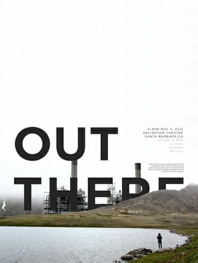
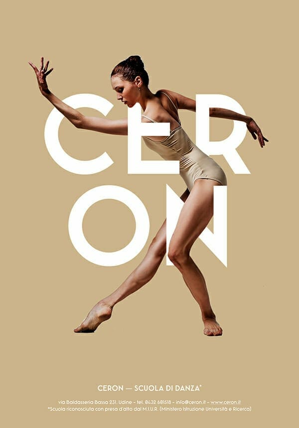
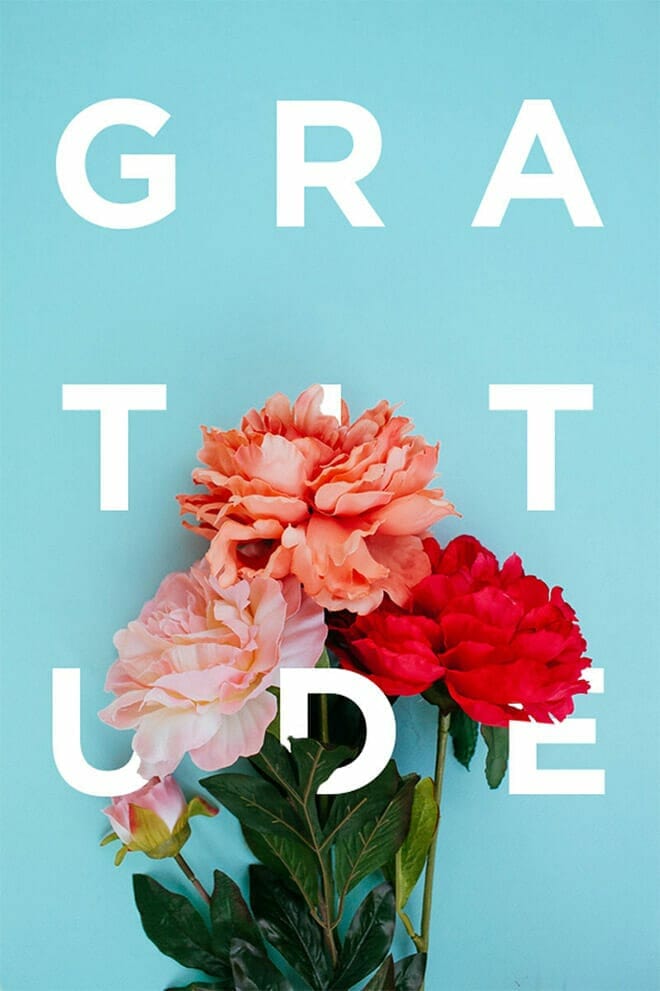
Via Andrew Pfund, Khuong Pham, Ivan Moreale, Gatis Vilaks
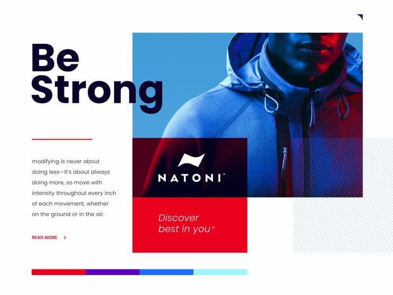
Flat Design + Realism
The term “opposites attract” comes to mind when looking at this up and coming trend. A mixture of flat design elements with photography or other elements of realism is a sure way to get noticed. This is a great solution if you’re looking to add contrast in a not-so-obvious way.
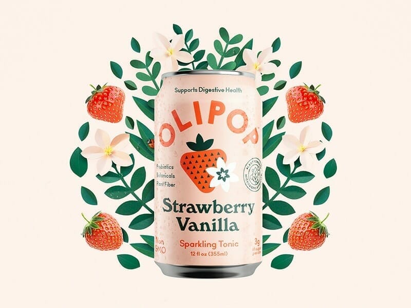
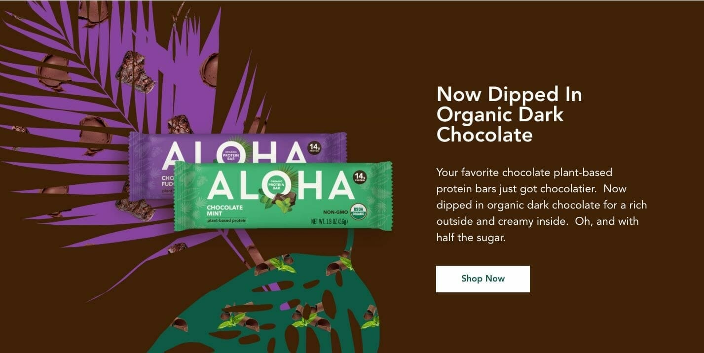
Via Kenny Coil, Aloha, Balraj Chana
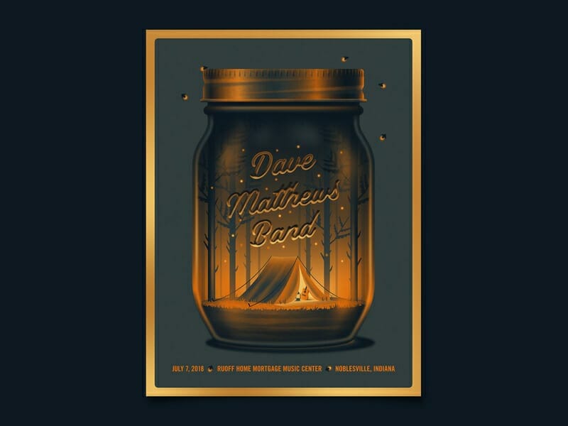
Old Style Serifs
It’s no secret that sans serif typefaces have ruled much of the modern design space. Just look at any modern company’s branding. With a return to nostalgia and retro inspired design, we’re seeing more and more old style and transitional serif fonts make a comeback. If you want to inject a little more personality and character into a design, this is a good place to explore.
Via Collins, Levi Lowell, Nathan Riley
Gradients
Gradients have been trending for a couple of years now, and I don’t think they will go away anytime soon. These really show off what our state of the art screens can do, and i suspect this is why we’ve seen them become so popular in the digital space. When done tastefully with smooth transitions, gradients really add some dimension to otherwise flat illustration, or even serve as a great backdrop for photographic elements.
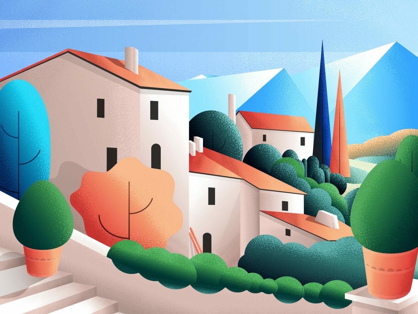
Via DKNG, Goutham, Magic Shape
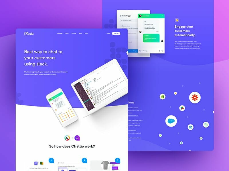
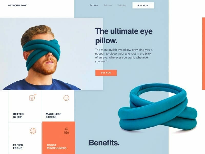
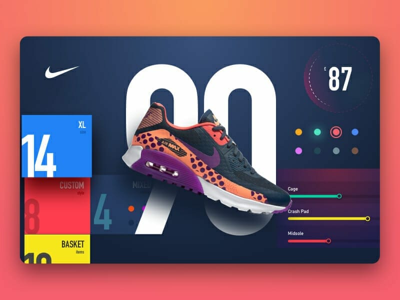
Asymmetrical Layouts
Asymmetry is nothing new to design as whole, but where we see it really emerging is web design. When designing for web, you essentially are designing on a grid most of the time. Layouts can easily become boxy. By breaking this grid you can really demand attention and stand out in the digital space.